Let’s Talk About Design
Today, I’m discussing design—poor design to be more specific. This the first part of my series “What’s Killing My Business Online.” With this in mind, I’m going to be explaining what design is, what poor design looks like, and how poor design can kill your business.
What is Design?
The best definition provided by Merriam-Webster for design (as it relates to this post) is:
The creative art of executing aesthetic or functional designs
To further elaborate, in the world of a designer design is anything that has an aesthetic purpose. That tends to raise the question of what separates design from art? The answer to that question depends on who you ask. The difference is that design is done with an intent to sell, while art is done with the intent to create. To further drive that home, good design seems to always sell a product, service, or even an idea. With that in mind, think about what sells you on the products and services you purchase and subscribe to while we move through the rest of this post.
What Does Poor Design Look Like?
Poor design is rampant. It can be found all over the internet and all over the world around you. I’m going to focus on what I know best and show three examples of poor design I’ve come across on the web and tell you why they are bad, and what they could have done differently.
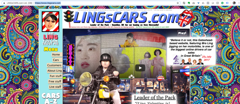
Example 1: LINGsCARS.com
LINGsCARS.com is a site that you may have possibly seen before. It became notoriously famous for how bad the design was. So famous, in fact, that LINGsCARS.com became “one of the biggest online drivers of car sales in Great Britain” in 2017. This site brings up many questions on what good design actually is. It drives incredible amounts of traffic to their business and draws a lot of media attention. In that regard, the site does its job, and it does it well. It separates the company from the pack and shows that they have a personality and sense of humor. It pulls off something that is even more difficult than designing well: designing so poorly that it’s good.
So, the question comes up: “How is that bad design if it does those things so well?” The answer is somewhat simple: “Look at it!”
The site has incredible amounts of motion that distract users from accomplishing tasks. If you include the motion with the incredibly overcomplicated background designs and images, it’s easy to see that users will not want to spend a whole lot of time on this website short of their initial visit to see what all the talk is about and get a good chuckle. This site is an example of what not to do 99.99% of the time. Not many can accomplish the results that Ling’s did with a design that is so difficult to digest.
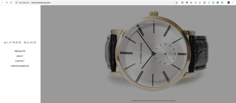
Example 2: alfredsung.com
Alfred Sung is a fashion designer. Known for creating apparel and accessories of huge expense and beauty. The website for this endeavor is very much on the same path. It shows off the products beautifully and in full-screen views allowing users to get a sense of how beautiful the product is. The design is very minimal and clean, so it doesn’t detract from the product. The biggest issue with the site: The design is very minimal and clean, so it doesn’t detract from the product. That’s right; it’s a double-edged sword. This site, though beautiful, is quite poorly designed. The navigation is clunky and nearly inoperable. Users have a difficult time finding where they are on the site, and how to get back to where they came from after they clicked through. Did I mention that it only works on a computer screen? Want to check out Alfred Sung’s products on your phone? Forget it. Spoiler alert: you end up with a beautiful blank screen.
Basically, alfredsung.com has committed a cardinal sin of design: they put form over function. Good design is well thought out, planned, executed, and tested. This problem is becoming all too common in web design. Designs are done and implemented, but there is no follow-up or quality assurance. With no follow-up or quality assurance, how can you make sure the site is not just functioning correctly, but accomplishing goals to drive sales and actions that help the business?
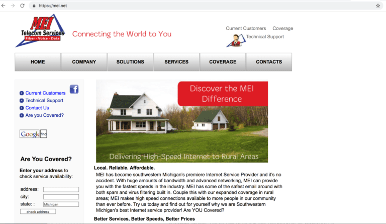
Example 3: mei.net
MEI Telecom Services is a smaller scale telecommunications company that provides home phone and internet services. I’m picking on these guys because they are local to me and large enough that they should have a better-looking site than they do. If anyone over at MEI reads this, please give me a call or go on over to my Getting Started section so I can help you out. I would love to turn this into a great case study about overcoming poor design and help out your business.
With that little bit out of the way, let’s dig into the issues that this site has. The biggest one is a lack of any design whatsoever. It lacks any character that would uniquely separate the brand from its competitors. Looking at their competitors in the area, you might think that they wouldn’t be able to offer you a service you could use. In reality, they provide some of the fastest internet speeds in the area and are going to be releasing a brand new fiber network to their customers soon. Look at the examples of their competitors’ websites below.
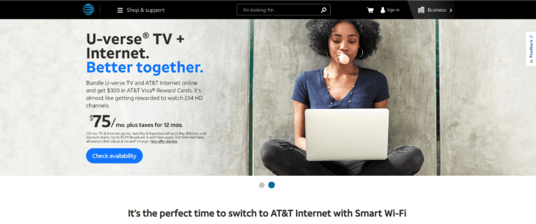
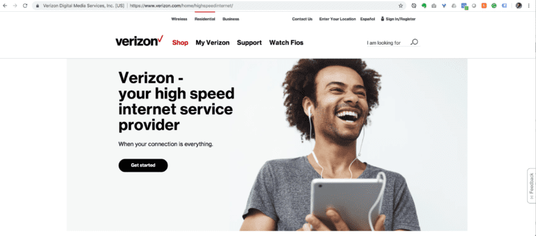

What would you choose?
Between ATT, Verizon, and Hughes Net, would you choose MEI with how they portray themselves? Don’t get me wrong. The site displays pertinent information such as coverage areas, technical support contacts, what services they offer, and a little bit of information about the company itself. It is functional. It is not necessarily easy to find this information at first glance, and they buried relevant links under heaps of tables and boring black and white print content.
To reiterate the most significant reason of why this is poor design: the site is underdesigned. It lacks thought or consideration to its users. It also provides nothing of visual interest to separate their brand above the competition.
How Poor Design Can Kill Your Business
This statement is going to be brief. Poor design will kill your business because, at some point, your competition will surpass you. Your potential customers will pass you over for someone that pays closer attention to their needs and wants. Good design can build trust and brand recognition. It can help create word of mouth marketing opportunities that you wouldn’t have otherwise. It will make your customers happy and appreciate you more. Poor design tends to have the opposite effect. Even if your competition has poor design, you can set yourself apart by offering your customers something the rest of the competition cannot. Don’t let that happen to your business.
